96 stickies with feedback
Overview
Once upon a time… C&P Team wanted to understand how users interact with our product. We didn’t know if things we’re building and maintaining are user friendly. We decided to conduct user test sessions. Many “OMG, this is really not user friendly” were put out there during those sessions. Below you can find details on how we prepared sessions, run it and managed the outcome.

Details
How preparations looked like
#1 We created a page with:
- a game plan, list of tasks that we ticked each time something was delivered,
- list of participants (new Simployees, power users, different experience with our app),
- useful links and more.
And kept those things up to date, editing almost every day.
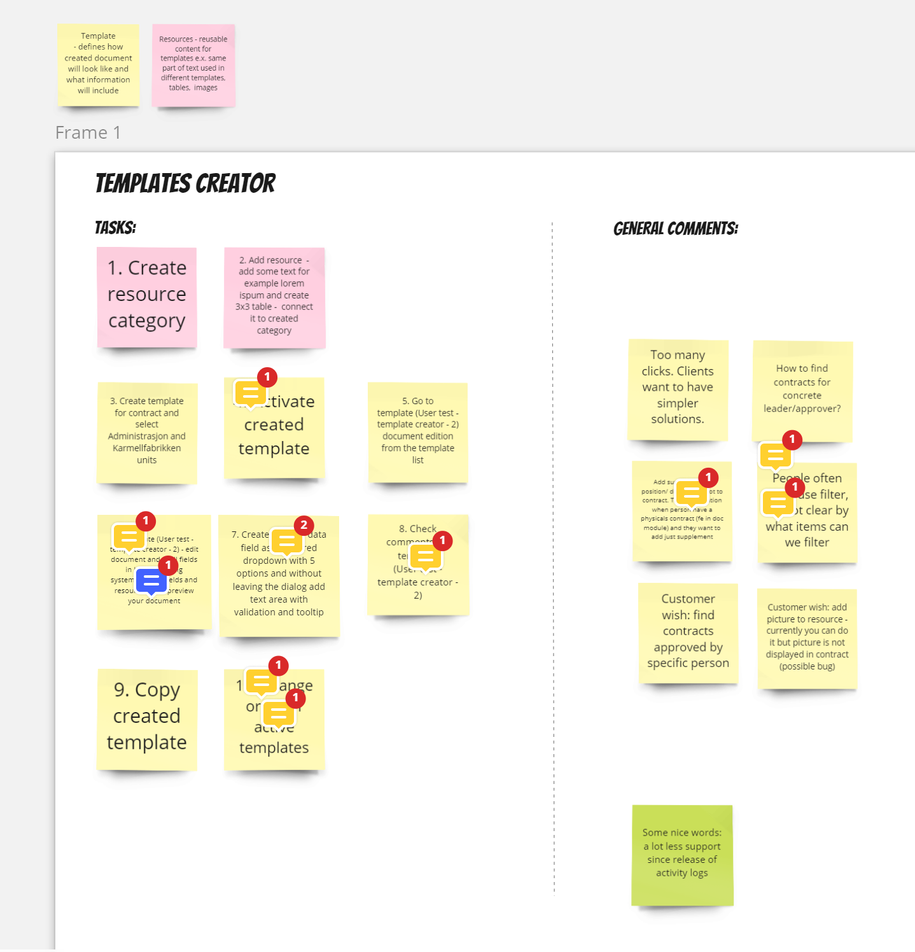
#2 Using Miro, Magda prepared tasks that our users will perform. You can check examples below.

Initially there was one board for all participants but we decided that each participant will have separate board. First boards were discussed with the team and we made few improvements (i.e. complexity).
#3 Standard stuff of inviting participants: first we talked to our guests on workplace, next we sent them invitations.
#4 On a day of sessions we met up to check if everybody (from our team) knows what to do etc.
How user tests looked like
We wanted to run 7 user tests sessions very quickly. Therefore we split into subteams. Each consisting of 2-3 people from our team + 1 assigned participant.
This way we:
- kept everybody unbiased (separated participants and sub teams)
- kept everybody fresh and not overwhelmed with too many sessions
- could fit it into our calendars more easily
Each session took around 45 minutes. Scenarios were quite simple:
- explain the background (what role participants are about to play)
- explain the rules of workshop
- let participants perform their tasks
- discuss what happened :slight_smile:
Ad. 3 - we told them to say out loud what they were thinking but we didn’t comment on it, didn’t want to interrupt, kept track of all comments, making notes etc.
Ad. 4 - on this stage we commented on participant’s impressions, strange situations
All of those comments were noted on Miro board. Each session had separate board. This way it was clearer to manage the whole outcome.
How summary of user tests looked like
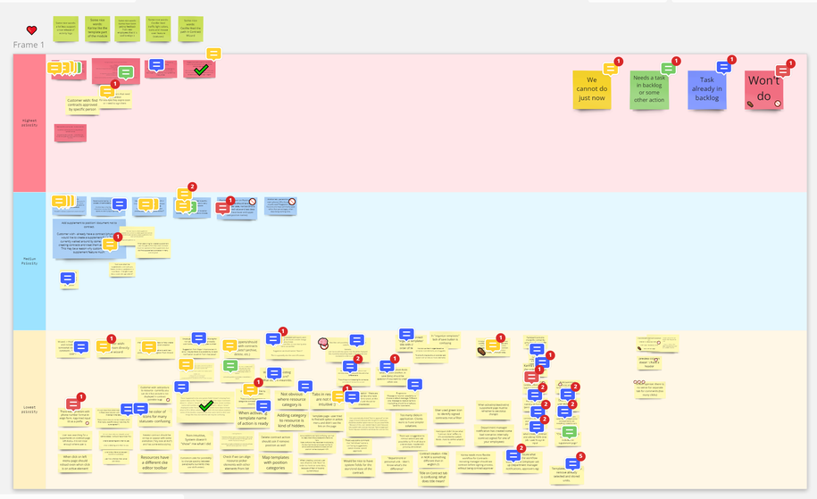
After sessions Magda took some time to filter the comments, gather them on one board. Next we set priorities - what remark is more important, what is less important. Along the way we set some color coding in place. You can see it below.

How we managed the outcome
Few times we met up and discussed the feedback we received We found a balance between discussing the feedback and starting to implement improvements - we knew that going through all of 96 stickies can take some time, we decided to filter first few items, add them to the backlog, start working on it and while items are being developed revisit the board and go through rest of the stickies few times more. So far we did ~4 sessions discussing gathered feedback, each session taking ~1 hour.
After we decide some item is worth adding to the backlog, we add it, refine it, estimate size of it, assign it to one of future sprints and next implement it. After adding it to the backlog we also add label “OKRs” to it - this way we can track all of those items from user test sessions in Jira. You can check it below.
Summary
As you can see - sometimes it’s not that hard to understand if your product is user friendly. And it’s really worth doing! Sometimes you may discover that only you know how to use a function :slight_smile:
TL;DR
- such sessions can take ~45 minutes and can be hosted by 1-2 people from the team with 1 participant
- it’s important to start implementing improvements as soon as possible - if you first go through the whole feedback you will waste some time waiting for the end of such feedback filtering
- teamwork is essential!
